A wonderful serenity has taken possession of my entire soul, like these sweet mornings of spring which I enjoy with my whole heart. I am alone, and feel the charm of existence in this spot, which was created for the bliss of souls like mine. I am so happy, my dear friend, so absorbed in the exquisite sense of mere tranquil existence, that I neglect my talents.
I should be incapable of drawing a single stroke at the present moment; and yet I feel that I never was a greater artist than now.
JMAGZ GALLERY
When, while the lovely valley teems with vapour around me, and the meridian sun strikes the upper surface of the impenetrable foliage of my trees, and but a few stray gleams steal into the inner sanctuary, I throw myself down among the tall grass by the trickling stream; and, as I lie close to the earth, a thousand unknown plants are noticed by me: when I hear the buzz of the little world among the stalks, and grow familiar with
TILE GALLERY
- The copy warned the Little Blind Tex
- Even the all-powerful Pointing has no control
- Vivamus elementum semper nisi. Aenean vulputate eleifend tellus.
- I throw myself down among the tall grass by the trickling stream
- Sebotol Vas Bunga Nedeng Kembang
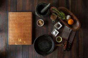
- Wooden desk
- Drops of rain could be heard hitting the pane
- It’s always good to have a cup of cappuccino in the morning
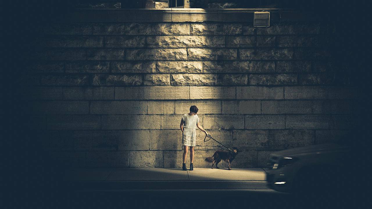
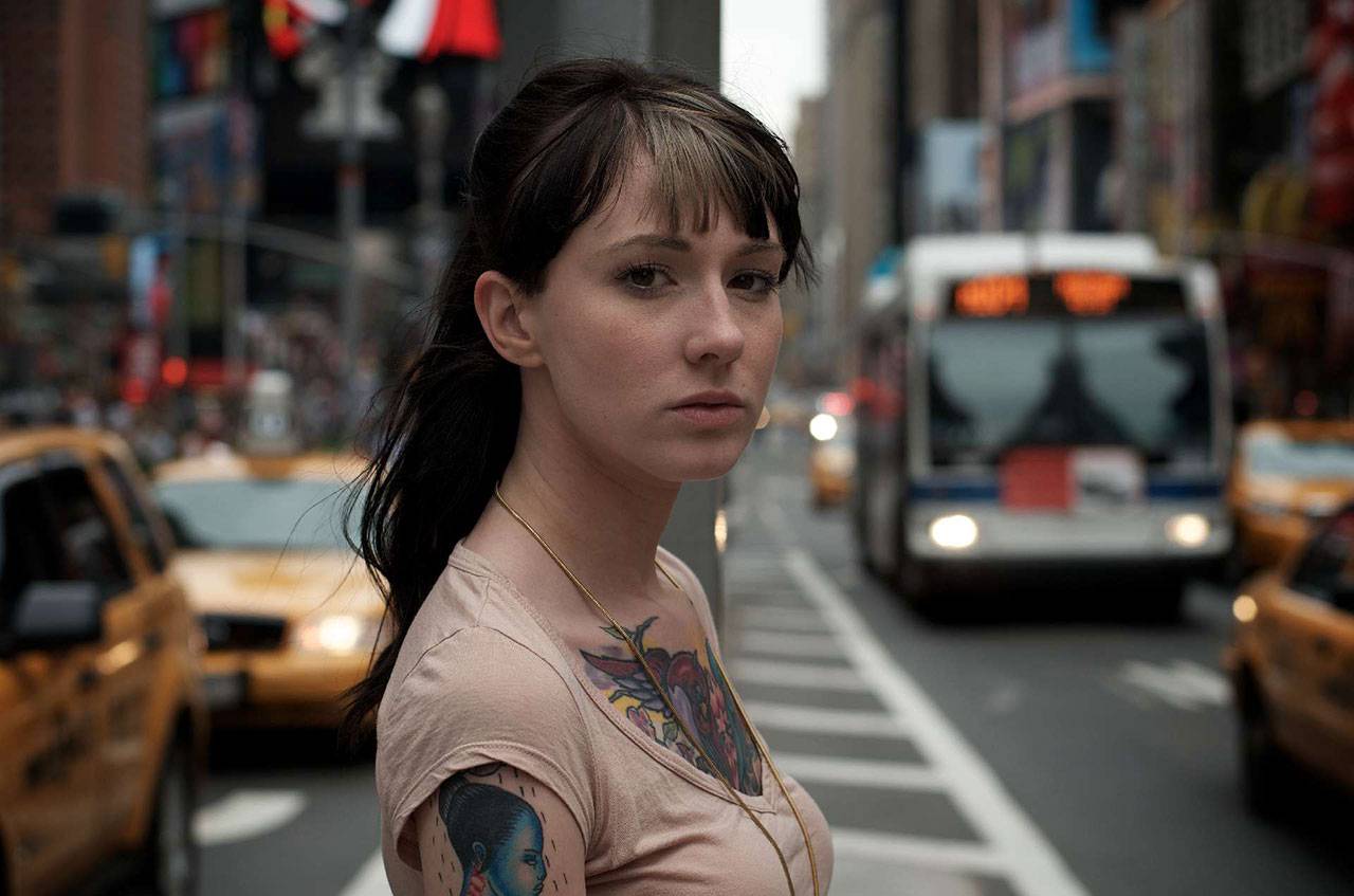
- Girl with tattoo on the traffic
- I am alone, and feel the charm of existence in this spot
- Gedung kone adane ne
- I should be incapable of drawing a single stroke at the present
I feel the presence of the Almighty, who formed us in his own image, and the breath of that universal love which bears and sustains us, as it floats around us in an eternity of bliss; and then, my friend, when darkness overspreads my eyes, and heaven and earth seem to dwell in my soul and absorb its power, like the form of a beloved mistress, then I often think with longing, Oh, would I could describe these concept.
IMAGE ALIGNMENT
Welcome to image alignment! The best way to demonstrate the ebb and flow of the various image positioning options is to nestle them snuggly among an ocean of words. Grab a paddle and let’s get started.
On the topic of alignment, it should be noted that users can choose from the options of None, Left, Right, and Center. In addition, they also get the options of Thumbnail, Medium, Large & Fullsize.
The image above happens to be centered.
 The rest of this paragraph is filler for the sake of seeing the text wrap around the 150×150 image, which is left aligned.
As you can see the should be some space above, below, and to the right of the image. The text should not be creeping on the image. Creeping is just not right. Images need breathing room too. Let them speak like you words. Let them do their jobs without any hassle from the text. In about one more sentence here, we’ll see that the text moves from the right of the image down below the image in seamless transition. Again, letting the do it’s thang. Mission accomplished!
And now for a massively large image. It also has no alignment.
The image above, though 1200px wide, should not overflow the content area. It should remain contained with no visible disruption to the flow of content.
And now we’re going to shift things to the right align. Again, there should be plenty of room above, below, and to the left of the image. Just look at him there… Hey guy! Way to rock that right side. I don’t care what the left aligned image says, you look great. Don’t let anyone else tell you differently.
In just a bit here, you should see the text start to wrap below the right aligned image and settle in nicely. There should still be plenty of room and everything should be sitting pretty. Yeah… Just like that. It never felt so good to be right.
And just when you thought we were done, we’re going to do them all over again with captions!
The image above happens to be centered. The caption also has a link in it, just to see if it does anything funky.
The rest of this paragraph is filler for the sake of seeing the text wrap around the 150×150 image, which is left aligned.
As you can see the should be some space above, below, and to the right of the image. The text should not be creeping on the image. Creeping is just not right. Images need breathing room too. Let them speak like you words. Let them do their jobs without any hassle from the text. In about one more sentence here, we’ll see that the text moves from the right of the image down below the image in seamless transition. Again, letting the do it’s thang. Mission accomplished!
And now for a massively large image. It also has no alignment.
The image above, though 1200px wide, should not overflow the content area. It should remain contained with no visible
disruption to the flow of content.
And now we’re going to shift things to the right align. Again, there should be plenty of room above, below, and to the left of the image. Just look at him there… Hey guy! Way to rock that right side. I don’t care what the left aligned image says, you look great. Don’t let anyone else tell you differently.
In just a bit here, you should see the text start to wrap below the right aligned image and settle in nicely. There should still be plenty of room and everything should be sitting pretty. Yeah… Just like that. It never felt so good to be right.
And that’s a wrap, yo! You survived the tumultuous waters of alignment. Image alignment achievement unlocked!












Discussion about this page